The journal I write for myself gets more attention from me than any of my blogs. The blogs are public while the journal is a mix of stuff that mostly does not become public.
Sometimes bits from the journal rise out of the junk because I (foolishly) think that someone in the “public” might be interested in what happened.
I had occasion to go back to revise an entry from March. It seemed like a good idea to make it clear that the update was done today and not done back in March. A simple parenthetical line might have done the trick, but I am working in Markdown to produce the journal in HTML to make it a visually interesting journal with screen captures, photos, live links, etc.
That meant finding a trick to make the note stand out. I thought that if the journal had been done by hand with a pen and paper, the added info would have gone in as a marginal note. Well, using the tricks of Cascading Style Sheets (CSS), I can easily add text which appears on the right edge of the web page in the journal.
Step 1
Add a CSS class to the “header” of the journal. In my setup, I have each entry as a markdown formatted file labeled by date.
The very first file for the year (20150000.md) is my header file where I can put some CSS rules to control the look of the web pages. What I decided to use is the CSS for a class called “marginal”.
.marginal {
width: 300px;
border: 3px solid red;
border-radius: 20px;
background-color: blue;
padding: 10px;
float: right;
color: yellow;
font-weight: bold;
font-family: “Comic Neue”, “Comic Sans”, sans-serif;
// font-size: 1.3em;
}
Step 2:
Any time I want to add a marginal note, I drop in a div where I need it.
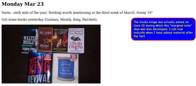
The result looks like this for the entry in question (from the 20150323.md file):

To me, the blue and yellow box at the right looks a little like a marginal note I went back to add. To you, it might look like something else, but then, this is about my journal. “Your Results May Vary”.
Cheers