Turtle Python
Back in the days when we used the AppleII at the middle school where I taught, we used a package called Delta
Drawing which had some of the features of Logo, the language developed by Wally Feurzeig and Seymour Papert to help develop early programming skills, even for elementary students. For a while Logo was
popular, but as administrators challenged the value of “Programming for
Everybody”, it fell by the wayside as BASIC had earlier. Apparently neither Logo nor BASIC were important enough to be part of the “back to basics” thinking that came with budget cuts.
The STEM initiative (Science, Technology, Engineering, Math) is having some success in education circles these days. In that context programming
is making a resurgence with the support of some heavy hitters in the tech world having political impact.
The “Hour of Code” effort is popular. Python is one of the languages
with traction, too. Python has Turtle Graphics available as a built-in
module. It is possible to use Python programming to do turtle graphics
in almost the same way they were done in earlier Logo implementations.
Turtle graphics are a very good way to introduce the concept of functions in Python.
I purchased a book from a member of the MathFuture Google Group.
Hacking Math Class with Python: Exploring Math Through Computer Programming by Peter Farrell [Link]
His book begins with a section on turtle graphics.
Typing the following code into the command line (Python interpreter
running) window will produce first a square and then a circle in a popup
window (using the built-in tk windowing tools).
python

from turtle import *

def square():
   for i in range(4):
       fd(100)
       rt(90)
square()

def circle():
    for i in range(36):
        fd(10)
        rt(10)

circle()
You might not be surprised that those instructions made a square and circle.


If you learned Logo, you will recognize the fd 100 as meaning “move
the turtle forward 100 steps.” Likewise, rt(90) was rt 90 or right 90
depending on the implementation of Logo you used. What is different is
the indenting of Python and the use of parentheses to indicate the
functions in use along with the Python structure of the loop which was
different in Logo.
Implementing a Logo-like turtle graphics environment in Python does
give us immediate access to visualizing the concepts expressed as
functions, a real leg up in the concept of functions in math.
That, of course, lead me to remember the “flowering” of my earlier
Logo days, and I made the rotations of both square and circle that were
such a rush for me back then.

I exemplified a bit of my sponsored wordnik word “explore” by making a
challenge to do a stack of polygons with one side overlapped
(congruent?).

>>> clear()
>>> lt(60)
>>> octogon()
>>> hexagon()
>>> pentagon()
>>> square()
>>> triangle()
I think I may enjoy going further in the book.
Continuing my P2PU Webmaking 101 thoughts, I’ve added a web page to explain how I see the fundamental tag elements of HTML.
http://runeman.org/programming/html/elements.html
It didn’t seem that a blog post would work as well as a real web page. So it goes.
You can leave complaints and comments here, of course.
This entry holds my thoughts about the beginning of the P2PU Javascript introduction study group.
- It is a guided experience (as advertised), not a group course. Before mine,the last comment left on the Week1 reactions was August 2011, just over 2 years ago as I write these thoughts. I’m wondering if I’ll be following along alone.
- The week 1 assignment is deceptively simple. The actual study material is significant.
- I am very confused by the complicated name, JavaScript, which in code is typically written all lower case “javascript” and, although developed by Netscape and deployed in their browser in 1995, the language name is somehow a trademark of Oracle (because they bought Sun Microsystems? Sun developed Java, to which Javascript is not connected, as far as I know.)[Wikipedia] You might have noticed that I’ve mixed in the three case usages which all seem to be common. Bear with me if I continue to do so.
Adding to my confusion, Microsoft has called their IE version “JScript” and the official international standards body calls the language ECMAScript
In 2013, I implemented a “spoiler” feature in my book list pages.
It was a bit clunky, making a jolting page shift to display the hidden spoiler text.
I recently reimplemented the technique. I’m happier.
If you are interested, check the description of how it was done.
The core JavaScript code was:
    function toggle_visibility(id) {
       var e = document.getElementById(id);
       if(e.style.display == ‘block’)
          e.style.display = ‘none’;
       else
          e.style.display = ‘block’;
}
In pursuit of web development skills, P2PU is a great peer support group.
The range of learning options includes many others, too. One I have been using is W3Schools where I came across interesting statistics about browser usage and also encountered a bit of irony shown in the next screen capture.
On the screen reporting a steady decline of visits with Internet Explorer since the start of the site, from 85% down to under 12% in 2013, Microsoft has an ad:
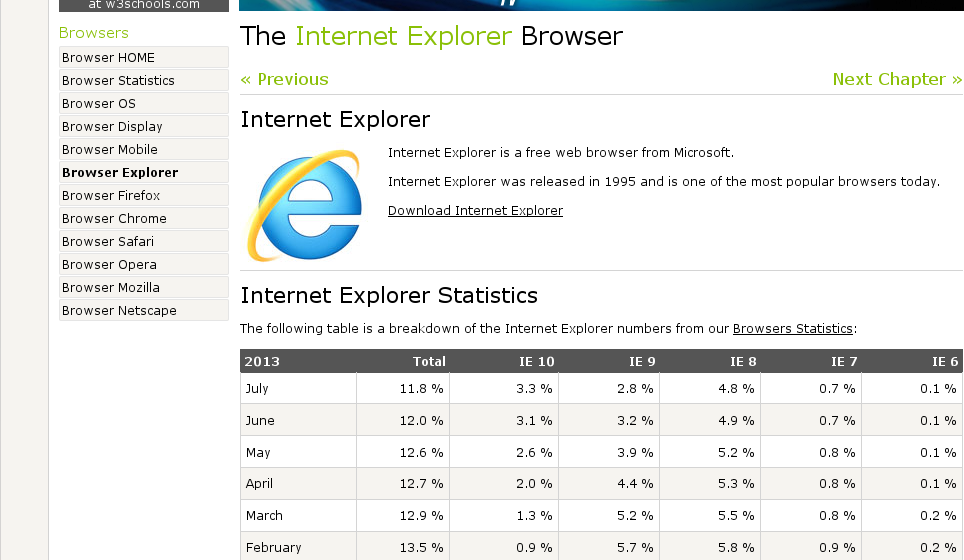
Of course, this site is mainly of interest to programmers and web developers, a small subset of the public. Still the statistics don’t match well with the contention of “one of the most popular browsers today” in the ad.
If the public still thinks Windows and Internet Explorer are the way to go, perhaps developers have a different point of view.
Little snips of JavaScript can add some significant power to web pages.
A good example is this new trick:
Let JavaScript count how many books I’ve read this year.

Periodically, I check my website statistics. One of the most interesting segments is the Failure Report. It shows what requests from visitors are failing. Any time a file accumulates a bunch of failed attempts, it catches my eye and I try to track down the problem.
Today, I noticed a new Failure. I had no idea what was wrong. A web search cured my ignorance.
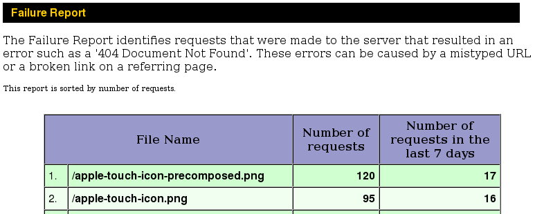
Apple, Inc. has implemented a substitute for the “favicon” that standard web browsers put into the tab of a page. The idea is that mobile Apple devices can save copy of a page which interests the Apple user. When they do that, the designated “apple-touch-icon.png” is used as a launch button on the device.
Being the conscientious webmaster, I quickly remedied the problem by creating my very own apple-touch-icon.
![]()
Mobile Apple users, thanks for visiting.
Writing html with a text editor ( Kate for me because I use KDE on GNU/Linux and because it is a very good editor ) is becoming reasonably comfortable. I’ve almost completely given up using the Kompozer visual Web editor. Almost, not quite, though. I have one page which functions well with a table to organize clipart image thumbnails and download buttons for the svg source. Until and “if” I change that page with CSS, Kompozer is easier to use to maintain and add new images.
Still, it is nice to see the web pages display the way I intend. Combining the html with a growing understanding of cascading style sheets is beginning to make sense. The results aren’t too ugly either.
A bit of JavaScript has helped me make a consistent navigation section appear on each page where it is appropriate. I love being able to modify just that one js file to add a new section to the site. Today, I even enjoyed rearranging the links into a much more sensible sequence.
Web development isn’t a single track or well-ordered sequence. At some point, the different skill sequences begin to blend into a very personal mix. The learning becomes a stream with tributaries of what you have learned of html, css, JavaScript, php and more.
Let the process develop. Make web pages build around things you enjoy. Let the pages become better while you work on your ideas. Go back later and make the content consistent with your new skills. Not all of your pages will need to be “the same” until you are doing a corporate site as a paid gig. Until then, have fun. Grow and keep learning.
This month, I was drafted into running the meeting of our local FOSS user’s group. The group’s founder was off on vacation in France. While we were meeting, he and his tech-savvy wife were drinking honest French wine with real French cheese and speaking real French (with a strong American accent, from what he reported by email).
That meant preparing demonstrations. They were fun to develop, lots of html coding. One of the topics involved demonstrating the forum software phpbb. I didn’t put the software on my hosted server. That seemed too permanent. If we decide to run a forum for the group, it makes sense to do it on a server “owned” by the group, not on mine. So I set up a “sandbox” installation on my home server. That meant getting the group access to the server.
Recently, I read in Linux Journal, about doing a little trickery to make “do-it-yourself DNS” which seemed cool. The forum demo was a chance to put the trick to the test. As you may know, the Internet-facing IP address of a home router isn’t a fixed IP. Verizon, like many other service providers, can change the IP address as often as they want.
Some people use a Dynamic DNS service. That costs extra to do it well and the concepts from Linux Journal article worked for me. I ultimately did a script which hourly contacts my hosted server and executes a php file there which makes a text file to give me the current Verizon-assigned IP.
The problem was, I also needed to make it easy enough for the FOSS group’s users. My initial efforts involved too many link clicks. Eventually, though, all the coding study of recent time came together.
I read about server-side-includes and was able to use the tricks from that to add a link to the changing IP address (within an hour, anyway). That link went into the demo page and got the group users to my home server’s index page. There were still too many links to click to reach the server.
Some of the members of the group are new to FOSS, and some are also self-styled novice computer users. The fewer clicks necessary to reach the forum, the better.
A bit more study to understand how concatenation works in PHP and there we were. PHP concatenation is tricky because it isn’t coded the way concatenation is done in other programming languages.
Now all a group member needs to do is reach my main hosted server and with a single click on the forum link, they are there. Two steps. I’m happy.
Coding is fun. For me, there are usually many tries and retries. That’s OK. The feeling of getting a working solution is marvellous!
Yesterday there were small JavaScript steps with popup alerts. See yesterday’s steps at Clicktests. To check out today’s steps, you go to the same place and look at Update text in place.
Today, the click tests go beyond alerts. Instead of popping up alerts with the score, the technique involves the use of the Document Object Model (DOM) and “innerHTML” which allows a bit of text to be replaced after the page has already loaded.
This makes the page change only the part that shows a score, a much nicer result than that intrusive alert box which needs to be cleared away by tapping the Enter key.
Small steps. Some of you are saying I’m too slow. Maybe you should remember I’m starting this at age 67.
The fifth version is still simple, but looks cool, if you ask me. In fact, I give it a score of 10.

These small steps are only possible because of resources from Web searches.
http://www.w3schools.com/css/css_positioning.asp
Also looked at several links about replacing text with this key element:
document.getElementById('foo').innerHTML = \"text you want\";
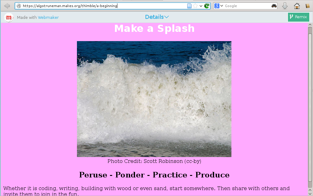
While reading a tweet (what a great resource of ideas from those I follow), I found out about Mozilla’s Webmaking tool called “Thimble.” It is a live Web editor. As you make changes to the code in an editor window, the right half of the window shows the effect of those changes.
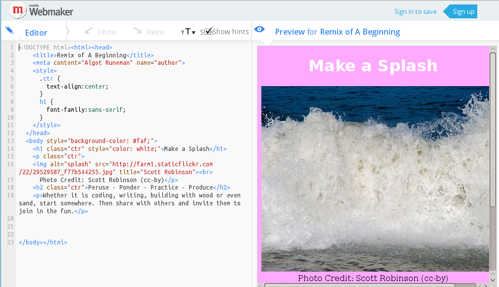
Here’s an example: https://algotruneman.makes.org/thimble/a-beginning
Mozilla encourages you to be a maker. Take up the challenge. Sign up. Get started.
Reference: http://lifehacker.com/5914119/mozilla-thimble-teaches-you-how-to-code-with-a-side+by+side-html-editor
A little of this, a little of that. This seems to be my syllabus. It is my personal “course” and I’m not expecting to get graded, so I’m comfortable with my meandering path.
It probably isn’t efficient, but then, I’ve never felt that learning is an efficient process. I find I make some progress, but only with trial and error. Figuring out what works means making a stab at a solution and taking the feedback of a failure. It also means seeking guidance from others (frequently through online searches these days).
OK, so what about the JavaScript counting?
I’d like to do some simple games at some point. Making them Web based seems like the upcoming thing with HTML5. JavaScript is the core scripting language of Web pages. Maybe it will turn out that Python is better (and I’m learning Python,too), but, I guess I need to try the different approaches to see what works.
Check out the first experimental steps here: http://runeman.org/programming/javascript/ and look for the Click Tests.